Taking Better Pictures
A good picture will get published a bad one will not. Below are some hints to taking better pictures. It doesn't really matter where the are going to be printed the guide lines below apply. Click on any image for a larger version.
Buildings |
|
 |
 |
|
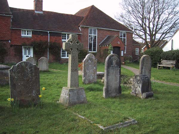
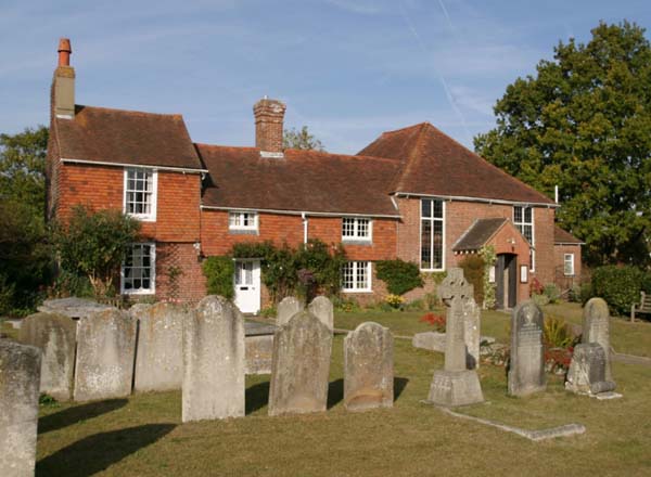
Two pictures of Ditchling Chapel from slightly different angles on different days. The picture on the right was taken on a winters day when the sun was shining on the front of the Chapel giving it so much more life. I was also standing on a wall to ensure that less of the cottage and Chapel where hidden by the grave stones. |
|
 |
 |
|
Two images taken from exactly the same location, but look at how the vertical lines are converging in the image on the left. Just by moving the moving the camera so the main part of the image is in the centre you can reduce this problem. Just look through the view finder and move the camera up and down and shoot with the minimum distortion, even if you need to crop the picture afterwards. |
|
 |
 |
|
Consider shooting in low light, while the two images here are taken from very different angles,
the one on the right has far more impact because of the light, a red sky would have been even better! |
|
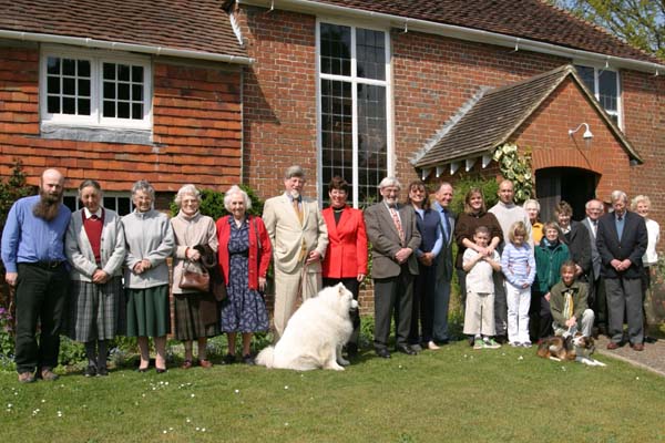
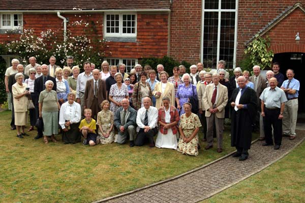
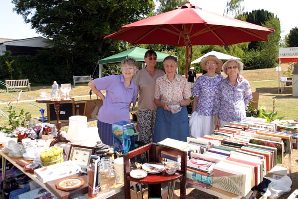
Large Groups |
|
 |
 |
|
The first shot is very poor, the photographer (me) has not arranged the people. The second image is better, the people have been positioned, the camera angle is much higher (on a chair) so the people at the back can be seen. Note the front line, it doesn't look good, they should all be men with one knee on the ground. |
|
Empty chairs |
|
 |
 |
|
Empty chairs always make a picture look sad, these two images were taken a few seconds apart, but the new angle makes the difference. |
|
Small Groups |
|
 |
 |
|
Two local events are shown above. The image on the left was a plant sale where I didn't ask people to look up and pose for the picture, the result is very boring and unusable. It would take a long caption to explain what is happening and if you need a caption, its a poor picture. The image on the right at a village fair was posed. I tried to get the people not to stand in a line and the image would have been stronger if there had been even more depth in the group. Don't be afraid to ask for your subjects attention while you snap away. |
|
Dead space |
|
 |
 |
|
Editors do not like wasting space. In both these two images there is a large area that doesn't add anything to the picture. The one on the left I like as a picture, but it would not get published because of the large gap in the middle. |
|
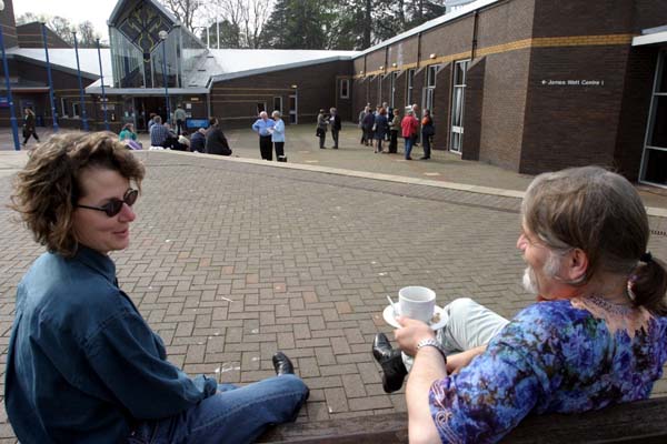
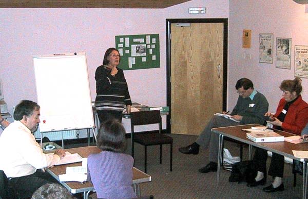
Boredom |
|
 |
 |
|
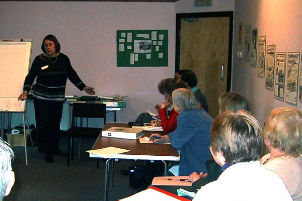
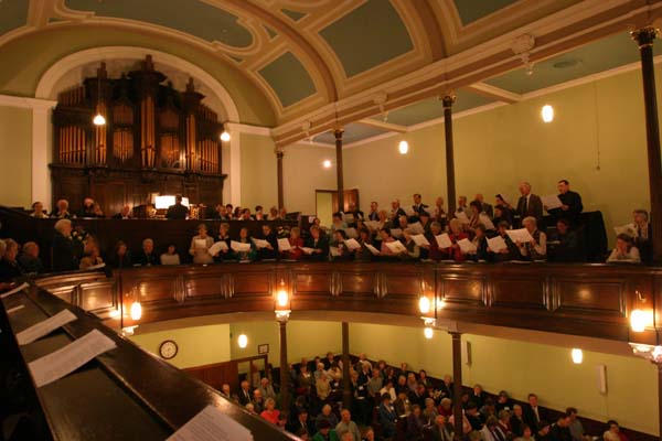
Two pictures of from the same presentation. Nobody was bored here, but looking at their papers or writing notes makes them look that way. Try and get your photo at the start of the session when everybody is looking at the presenter or move round so you can't see their faces, like I've done here. |
|
Portraiture |
|
 |
 |
|
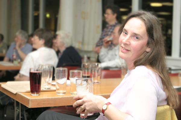
Facial expressions can make or break a photograph as you can see here. If you can, take several photographs quickly while talking to the subject. Conversation will invoke different expressions. Their is a rule that says a subject should be about one third from the side of the shot and the same from the top or bottom. It doesn't always work, but its a useful guide. Try and get more light on one side of a persons face than the other, well over done here, it give the face more depth. |
|
Smiles |
|
 |
 |
|
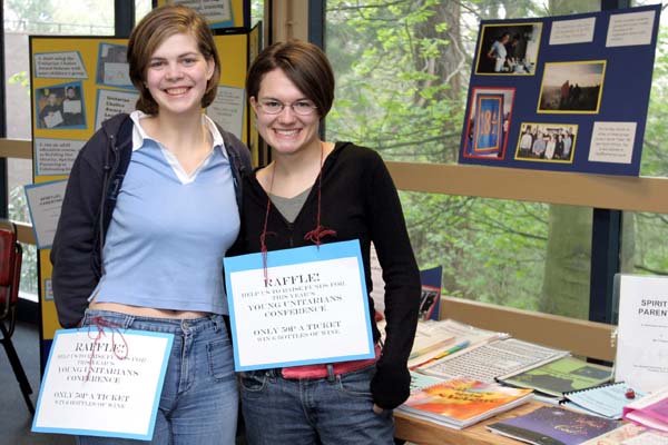
The smiles in these photographs make the shots. We all like photographs of happy souls. Before you approach somebody who you are going to photograph, try and think of something happy or funny to tell them, it might help. Some people freeze up in front of a camera and you need to break that ice. |
|
Sprouting heads |
|
 |
 |
|
Try and ensure that nothing is growing out of somebody's head. A small change in position can make all the difference. In the second shot their is a line going into his head which can be removed digitally to create a clear shot, but as it stands it much better that the picture on the left. An image looks more balanced if the person is looking into towards the center of the photograph. i.e. if the people is on the left on the image they should be looking to the right or vica-versa. From that point of view the image on the left is better. |
|
Backgrounds |
|
 |
 |
|
Backgrounds set the scene but can take your eye off the subject. With some camera you have the opportunity to increase the aperture of the lens (a smaller 'f' number). Doing this will take the background out of focus. The photo on the right is an example. Notice how the subject is pointing towards the center of the image. |
|
Big people |
|
 |
 |
|
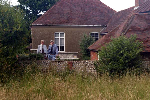
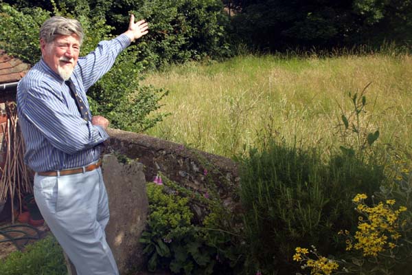
These images were taken when we were trying to purchase some land next to our Chapel. The subject was the land, not the trustees sorting out the purchase, but the right image is so much stronger and was published. If people are in a picture, you need to see the whites of their eyes! |
|
Flash shadows |
|
 |
 |
|
Know the position of your flash in relation to the lens. The shadow created by the gap between these can ruin the shot. In the first example here you can see the problem. You could take the shadow out with a computer, but this is not always easy if its a complex background. In the right image, the picture is better with only a small shadow because the flash was right over the top of the lens and we are not looking underneath anything large. Its always more of a problem when the flash is on the side of the camera and not above it. If your camera is like this, consider twisting the camera round 45 degrees to ensure the flash is on top and then rotating the picture back on the computer later. Camera flashes are a double edged sword so I always try taking some pictures with it turned off. I'll support the camera on a chair because it will take the photographs with a slow shutter speed and so it must be kept still. I'll then sort out which shots were better (with or without the flash) on the computer afterwards. |
|
Editing Pictures |
|
 |
 |
|
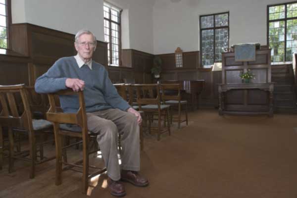
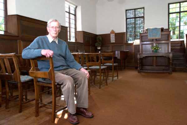
If you do take pictures under artificial lighting without a flash you will find that the colours are not accurate, but don't worry about this problem. It is quite simple to correct the colour balance with computer software. Here I have used the white hymn sheets as my guide to correct the colour as the walls were not white. |
|
Changing the image |
|
 |
 |
|
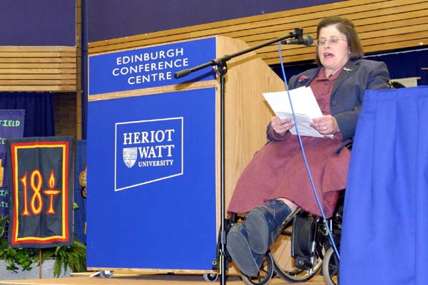
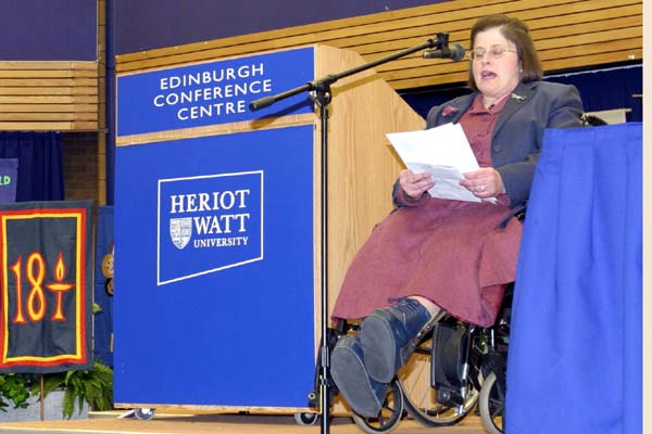
Once you get familiar with editing software there are lots of tricks you can perform. Here I have removed a microphone lead that cut right across the main part of the image. Once you know how to do this, it takes only about a minute to do. You can improve your finished results even if some people consider it cheating! |
|
Histograms |
|
 |
 |
|
These are amazing! Look at the graph above. As it goes from left to right it displays the number of pixels from dark to light - the higher the 'mountain' the more pixels of that brightness. As there is very little on the right side it means there is no bright pixels in the picture. By moving the sliders at the bottom (show in red below) you can stretch the 'brightness' range of your picture. The left slider will turn the dark pixels black, the right slider will whiten the bright ones and the centre one alters the mid-tones. It can transform a dull looking picture to a good one. The example here is in Photoshop, but all good graphic packages have this facility, including Paint Shop Pro. Histograms can also be used to see is your picture is too dark or light. If the the high peaks are on the left it should be lightened, if they are on the right, they should be darkened. |
|
 |
 |